SENTINEL
Services we provide:
- Discovery
- Strategy
- UX/UI design
- Website development
- Kentico implementation
About Sentinel
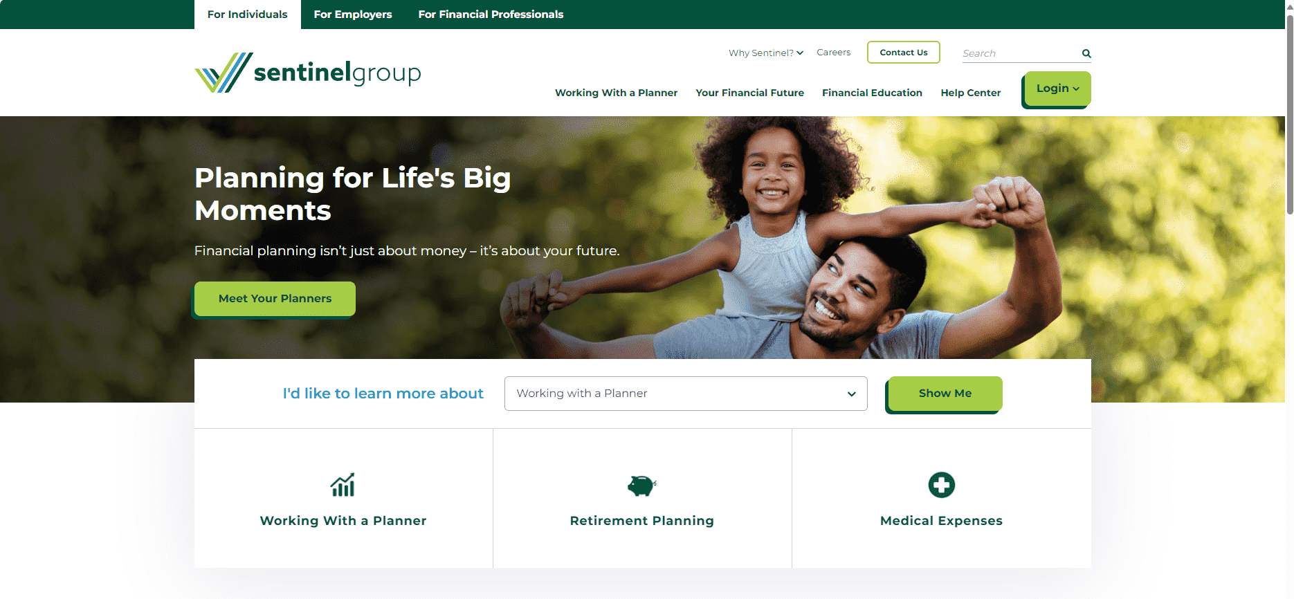
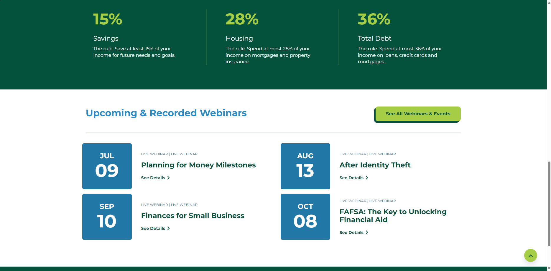
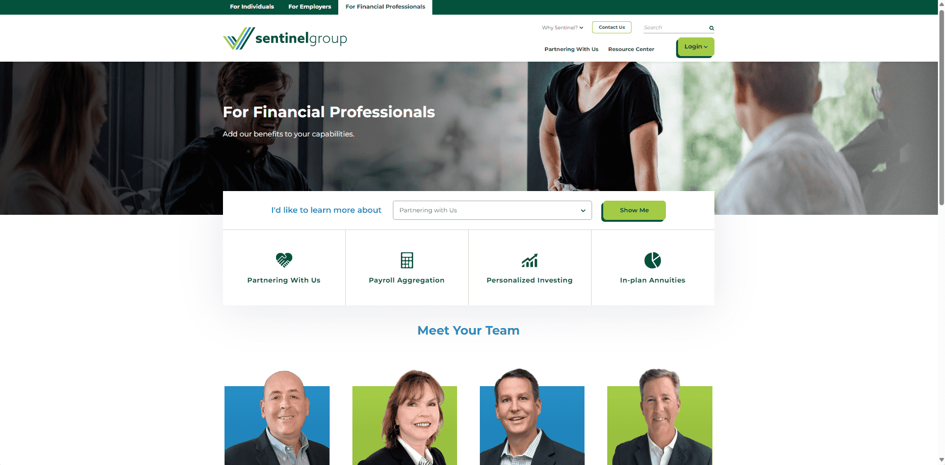
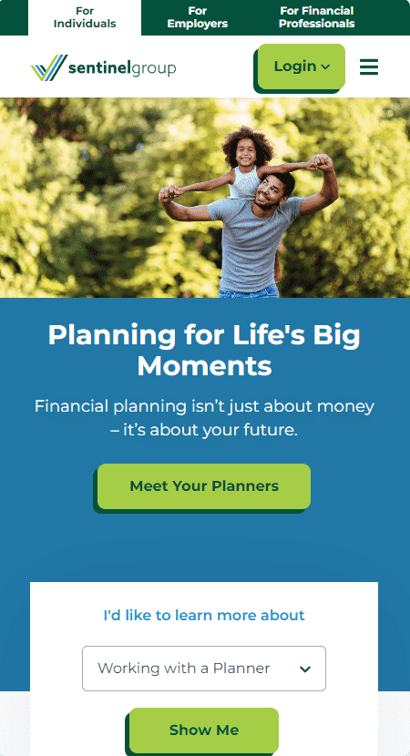
Sentinel is one of the largest employee benefits providers in the Northeast with 4,000+ clients and more than 250,000 plan participants. Sentinel partnered with SilverTech for their website redesign to accentuate their competitive advantages to other providers and strengthen brand messaging and company culture online. Additionally, they wanted to highlight Sentinel as a one-stop-shop benefits provider for employers and employees. Sentinel sought SilverTech’s expertise to create an experience geared towards the individual including storytelling elements through iconography, lifestyle-type imagery, and testimonials on their website.
The Process
Sentinel chose SilverTech’s recommendation of Kentico for several reasons. What appealed most to them was the easy-to-use interface for content editors, the ability to tag content clearly and effectively for multiple user groups, varied ability levels/place in the sales funnel, and the platform’s marketing automation abilities. Since the main goal of this website redesign was to create lead generation, the power and customizable functionality of the Kentico CMS coupled with the easy-to-use personalization and marketing automation features was a no brainer for Sentinel.
The Challenges
SilverTech faced several challenges throughout working on this project. One of the pains of Sentinel’s old site was that the homepage was difficult to use, asking users to act before understanding who Sentinel is. The new website clearly communicates the Sentinel brand before asking users to act. Another challenge that SilverTech faced was placing educational materials and related resources in a location and manner on the website that would be the most beneficial to users. This would make it easy for users to find information on their own and eliminate the need for Sentinel to send users direct links to the information. Sentinel loves the new website and SilverTech was able to address all the challenges of the old website.
RESULTS
10 Quick and Inexpensive Ways to Improve Your Web Experience
By: Erin Presseau | 5/19/21
How to quickly implement the ‘low hanging fruit’ you may not have considered.
We often hear from businesses that making user experience improvements requires a significant web overhaul and can often require a new digital experience platform or CMS migration. Depending on your situation, that may be true to a point but there is usually tons of ‘low hanging fruit’ that you can implement in just hours and for hardly any additional cost. It does take some time and a new perspective but these items come to mind when I think about making quick and inexpensive website experience updates.
1. Add a chatbot
Unless you have your own customer service or call center, it can be difficult to resource a ‘live chat’ feature. However, using a chatbot, which is an A.I.-powered computer-generated bot to help direct customers, can provide immediate help to web visitors while not requiring additional staff. SilverTech is even in the process of adding a chatbot to our website. It's surprising how easy it is to find a third-party chatbot, configure it with a simple workflow, and get it installed with virtually no support from designers or developers.
As a marketer, it is easy to get it up and running in just hours and with a low monthly cost, depending on which tool you use. For the web visitor, a chat allows a quick and easy way for them to answer questions and be directed to the right page without having to go through search or the site navigation. Plus, if they want to talk to a human, we can easily recognize that and ask them to provide an email or callback number so we can get in touch immediately.
Our SilverTech chatbot, (a.k.a. Simon), should be live shortly so you’ll have to check it out and let us know what you think.
2. Make content and CTAs conversational
The best and most effective user experiences are interactive and engaging. Talk to your website visitors as if it is a two-way human conversation. Use short and conversational dialogue and ask questions. Don’t forget that long and dense paragraph text is not the best for most web users to read online. Of course, you may want to refer visitors to longer format content in downloads or as they drill down deeper into a particular subject. But start the experience with ‘scannable’ (what we call bite-sized) content. Most web visitors (unless they are super-technical or engineering-focused) will not read the copy on your site – they will scan it. Use bullets, subheads, dividing lines and other graphics and design cues that allow the content to be ‘scanned’ but still gets the information across that they need to know.
3. Add CTAs at the bottom of key pages
Don't assume visitors are going to visit more than a few pages. At the end of every page on your site, you should direct web visitors to take action. That ‘action’ does not always have to be a button click, download or a form field. You can simply provide them with some copy that provides ‘next step’ options and links to help guide them to the next logical step.
For example, on a product page, the next logical step by the user might be to compare products or features against each other. Rather than hope visitors make it to your comparison page, guide the users there with a link and some copy at the bottom of the product pages. They are much more likely to follow your intended click path if you leave a solid trail for them to follow.
4. Evaluate user journeys from the perspective of your prospects or customers
If you aren’t sure what your intended click path is or what an ideal click path is for visitors to follow, you need to create a user journey map (also known as a customer journey map). A user journey map helps to identify, not only the click path that would help the visitor get to your intended goal (such as a contact form fill) in the least number of steps, but also identifies where or why they would get hung up, get distracted, encounter friction or bounce completely.
It is such an eye-opening exercise when we help clients develop user journey maps. We often help clients with this by creating workshops that ask internal stakeholders to step into the shoes of a prospect. We take them step-by-step to dissect every page that persona may follow and we ALWAYS find easy wins that no one saw before because they weren’t looking at the site from the user’s perspective. It seems like such a simple thing but it is often overlooked.
5. Search for prospective keywords using site search
This is a similar exercise to the user journey maps where you can step into a prospect’s shoes but, this time, you’ll be using the site search feature to find information and answer common questions on your website. Take note of what the search results summaries say. Do they make sense to an end user? Do they answer the question or take the user to the right page? Are there pages that show up that are completely irrelevant? Most times, you can uncover a major pain point for web visitors with this exercise.
In order to fix a basic site search feature, it is likely that you’ll need to update your meta info to be more relevant and to fix any issues that arise – most site searches use browser title and page name in the result descriptions. They may not always be accurate. This exercise will help you uncover what updates need to be made in order for web visitors to find what they need using search without having to click to multiple dead ends before identifying the right one.
6. Consider an ‘always-on’ brand paid text search ad
You may be thinking it isn’t needed to pay for a search ad for your brand name on Google or Bing. However, have you noticed that ads are taking up more and more of the first search results page and are pushing the organic listings to the bottom? Most users won’t even click beyond the first page. So, what does that mean for your website?
They may never find your organic search listing (even if it is the #1 organic listing) because they may get distracted by the ads, see a competitor's ad, accidentally click on one of the ads, etc. Plus, when you pay for an ad, you can also control what copy someone sees about your brand which may be better than the organic content that is pulled. These ads are also usually very inexpensive because there typically isn’t a lot of competition bidding on your brand name driving the price up. For those reasons, I fully encourage all my clients to ‘own’ their brand results page position by running inexpensive ‘always-on’ search ads. For many clients, the cost for these ads is a few hundred dollars per month or less.
7. Add an email auto-response to your contact form
As most know, it’s best practice to make sure that web users who have completed a form on your site get some sort of confirmation message that their information was successfully submitted. It is very important to at least show this information on the web page upon submission. However, most web content management solutions (CMS) or digital experience platforms (DXP), also allow you to send an email auto-response.
With an auto-response, not only are you confirming that their submission went through, but you can also provide additional information, cross-sells, up-sells or next-steps for onboarding. It is incredibly powerful and important to send an auto-response email. The lifespan in the inbox far outlives the confirmation page on the site, you can send additional relevant information as a follow-up, and the prospect can get used to seeing your email address as a white-list email sender.
8. Review your analytics landing pages
Where are visitors entering your site? Make sure that your key messaging and differentiators are at the top of those pages specifically. This seems like a fairly straight-forward suggestion, but it often gets overlooked. Again, look at your website through the lens of a prospect or customer. If they are entering the site on page A versus page C (most often due to a search engine or referring site sending them to a page other than the home page) will they know what you do, how you are different/better than the competition, etc. Take one page at a time and do your research. It will pay off, I promise you!
9. Include all methods of contact information on every page
This may seem like a no-brainer, but don’t just provide a contact form as the only way someone can contact you. I often talk to clients and ask them how they interact with companies they deal with in their daily lives. They say they like to email some, call others and often like to do it late at night or after business hours. So, why do they not think that their customers would want to do the same? Provide as many methods of contact as you can manage and provide access to it on every page of your site. Accessibility is always key.
10. Review your site on mobile and reduce page loading speed
Technically this is really two things but most companies we work with have 50% of visitors or more coming in on mobile devices. Even if you have a fully responsive website, take a walk in your prospect's shoes, and try to do all common web tasks on mobile. I guarantee you will find areas where either the mobile navigation design could be improved, or certain pages have images that are far too big and take up too much mobile real estate, causing the page speed to be much longer than two seconds. Page speed is important not only for user experience but for SEO now also with Google’s core web vitals update.
If you need help with these ideas or any others, our team at SilverTech would be happy to walk you through the process.
The one thought I would leave you with is this: The question isn't if you can afford to make user experience improvements to your website. The question is - how can you afford NOT to?


