Community West Bank
Services we provide:
- Discovery
- Strategy
- UX/UI design
- Website development
- Xperience by Kentico implementation
About Community West Bank
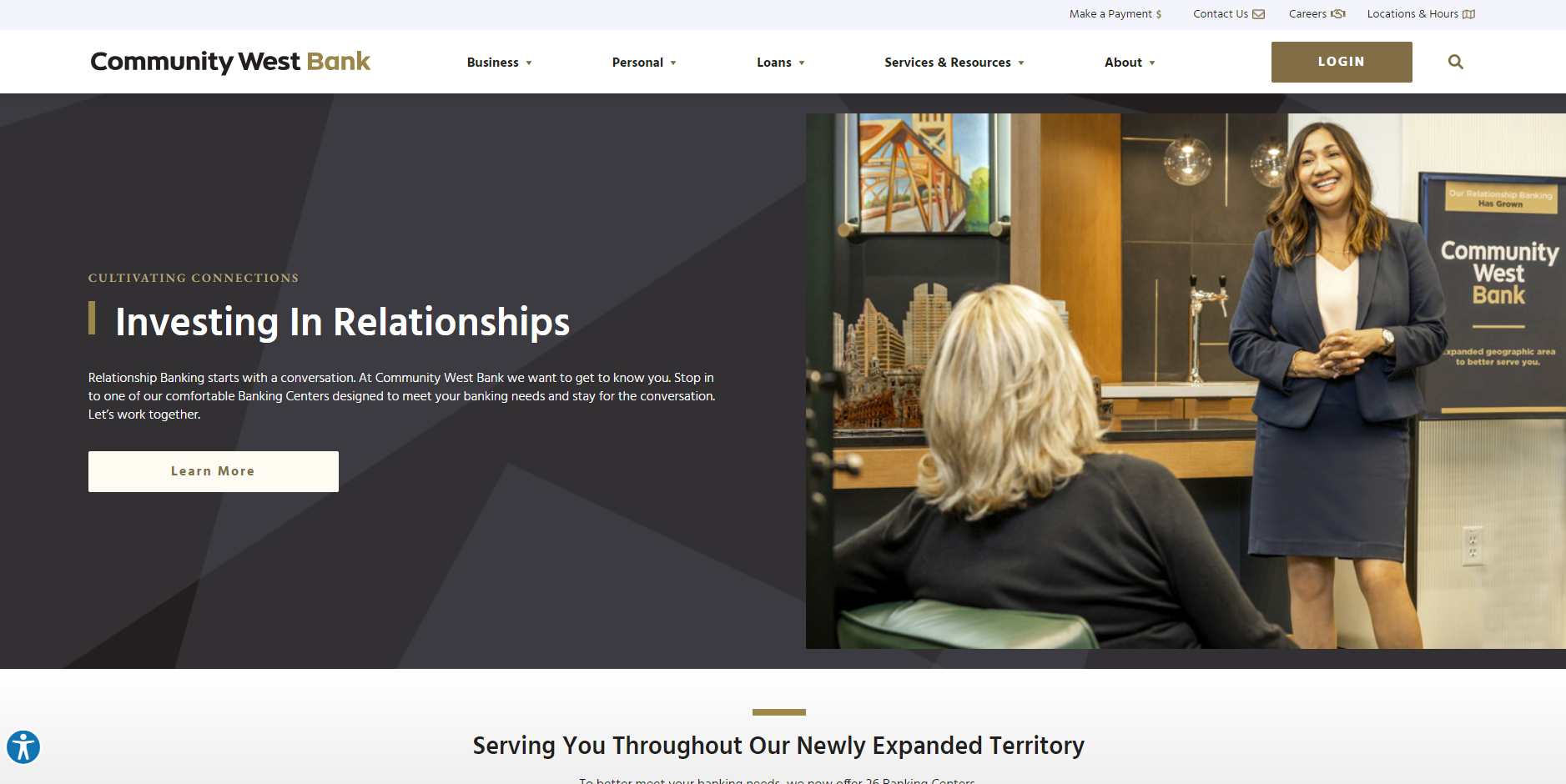
CWB is a large community bank in southern California with over 20+ locations and a track record of financial strength, security and stability gained over its 44 years in business. CWB has set itself apart from other banks by its people, dedication to client advocacy, exemplary "relationship banking," strong community support and a mission to exceed expectations. With a passion for providing customized solutions, the merger drove the decision to revamp their digital services to better serve their customers.
The Process
In an era where digital presence is critical to financial institutions and mergers are frequent, the successful merger of Community West Bank (CWB) and Central Valley Bank (CVB) depended on a robust and well-executed digital strategy, critical to providing a seamless user experience for customers and employees. SilverTech, leveraging its expertise in Xperience by Kentico website development, customized a digital solution that unified the brands of these two banks into one cohesive user-friendly digital experience in just 4 months from start to launch.
The Challenges
The merger of CWB and CVB presented unique challenges, particularly in integrating two distinct digital landscapes into a single cohesive website. The biggest challenges included:
- Differing Content Strategies: CWB's site was optimized for SEO with a rich content library, while CVB's site focused more on detailed product pages. Balancing these different content approaches was crucial.
- Short Timeline: The project needed to be completed with a demanding timeline, delivering a high-quality, functional website, from planning to launch in less than four months.
- Outdated Technology: The old CWB site suffered from poor mobile optimization, slow speeds, outdated information, and a lack of interactive features. This hindered customer engagement and usability.
Goals for New Site
SilverTech identified four main goals for CWB's new website with the main goal of unifying the brands. The merger of the two banks presented a unique opportunity to take advantage of the best from both brands.
Solution and Implementation
Based on the insight gained, SilverTech devised a comprehensive strategy roadmap to address the challenges and deliver a seamless digital experience for the bank merger. It was SilverTech's recommendation that Kentico's newest hybrid CMS platform Xperience by Kentico would be the best solution for the new website. Xperience with robust features and functionality allowed SilverTech to create an exceptional digital user experience efficiently for CWB.
The Key components of the solution include:
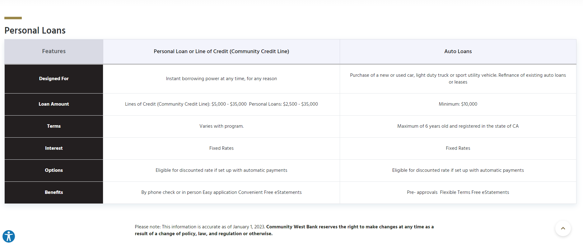
- Unified Content Strategy: SilverTech developed a content migration plan that combined the SEO-rich content from CWB with the detailed product information from CVB. This approach ensured that the new site would benefit from both banks' strengths while avoiding duplication and inconsistencies.
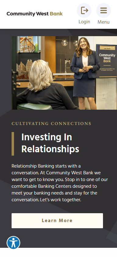
- Modern Design and Functionality: The new website was built with Xperience by Kentico, featuring a modern, responsive design to enhance user experience across all devices. Key features included:
- Enhanced Interactivity: Interactive elements and engaging content to improve customer interaction and retention
- Improved CTAs: Clear, strategically placed CTAs to guide users through the site effectively
- Technical Upgrades: Faster loading speeds, improved reliability, and mobile optimization to ensure a smooth user experience
- New Functionalities: Inclusion of essential tools like product comparison tools, branch locator and more
- Accelerated Development Timeline: Despite the tight timeline, SilverTech employed agile development practices to ensure timely delivery without compromising quality. The team worked in sprints to continuously test and refine the site, leading up to a successful launch within the four-month timeframe.
HIGHLIGHTS
Quality Assurance - Always Worth the Investment
9/14/20
Thorough QA process builds user trust and improves user experience
You’ve spent all this time and money on a website redesign. It’s designed beautifully. Your messaging targets the right audiences. And, you can’t wait to launch it.
But, will it work as intended? Will it not only function, but really work as hard as it can for you?
A website redesign is best when it accomplishes the goals you set out, and that includes providing a positive user experience. With user experience being a key component to why users stay or leave a site, it’s best to review your site before it goes live.
Quality assurance is one way of ensuring something maintains the desired level of quality in a product such as a website. The investment you’ve made in a website redesign or upgrade should be protected by having real users test the site. While there are tools you can use to find broken links, having real people test for usability is a vital step in the launch process so that you can protect the hard work and investment that went into a redesign.
Here are a few questions to ask yourself as you prepare your site launch:
How does the site interact in different browsers?
Not everyone uses Google Chrome. Firefox, Edge and Internet Explorer are other often-used browsers.
Just because one person uses Chrome doesn’t mean another user won’t use Internet Explorer.
While the basics of a website remain the same across browsers, it doesn’t mean they won’t look different in each browser and each browser version.
It’s important to check how your website looks and functions on different browsers since you don’t know how a user will get to your site. You wouldn’t want someone who uses IE to see a broken image box while a Google Chrome user sees the image without issue. Any font, design or other visual inconsistencies could create mistrust with a user, which could negatively impact experience and performance.
How does the website work on mobile?
At SilverTech, we create designs with a mobile-first mindset. With many people browsing sites via their mobile devices, we know we must create a website that functions seamlessly on mobile, without hacky design or functionality. No one wants to see a partial webpage upon arrival; they want the full picture, no matter the screen size.
We also must consider that on mobile users will want to use the site in a more actionable way, so you should be checking for functionality, such as:
- Do all phone numbers allow click to call?
- Do email addresses function as an easy way to contact someone and open your mobile email client?
- Do locations show up easily, without having to pinch and zoom?
If a website doesn’t work easily on mobile, users will be quick to leave the site and miss out on your important information.
Is the website ADA compliant?
Again, you never know who will visit your site. It’s important to be aware that some users may have physical impairments that make it challenging to access the website. Not only do you want to make sure those with disabilities or impairments are able to get the best experience from your site, but if you don’t there is legal action that can be taken against you in some industries and in some states. One of the most important QA processes of any modern website is to make sure it complies with ADA WCAG 2.1 standards (with WCAG 2.2 coming soon). Consider accessibility standards such as this:
- Do your colors have enough contrast?
- Does the text size adjust if needed?
- Does linked text appear differently?
Something as simple as a missing or misleading alt tag can cause confusion for a user who may be interpreting the content of your website via a screen reader.
There are many tools to use to help review your full site to ensure your site complies with ADA guidelines. SilverTech even offers a checklist.
Don't skimp on proper QA practices
After all the time and energy put in to create a new site, it would be a shame to have it not be everything you’d hope it to be. You wouldn’t want to have broken links or pages or not have it look consistent the moment a user visits it, so QA is not something to overlook.
The time to review the site before launch, catching any possible functionality or visual issues, is a key part of the process. Make sure you invest in expert QA practices, because what you don’t pay for now may cost you later.